Checkbox
The Checkbox item type is the default item type within the Ambifi Authoring editor. Checkboxes simply allow the user to view content such as a label or an image and click the checkbox to move on to the next item.
Checkboxes have no unique attributes.
Checkbox Demo
Styling the Check Item
Check items can be customized, specifically the component that is being used for data collection, we already showed how to customize content within a component and now we will evaluate how to address styling of the component itself.
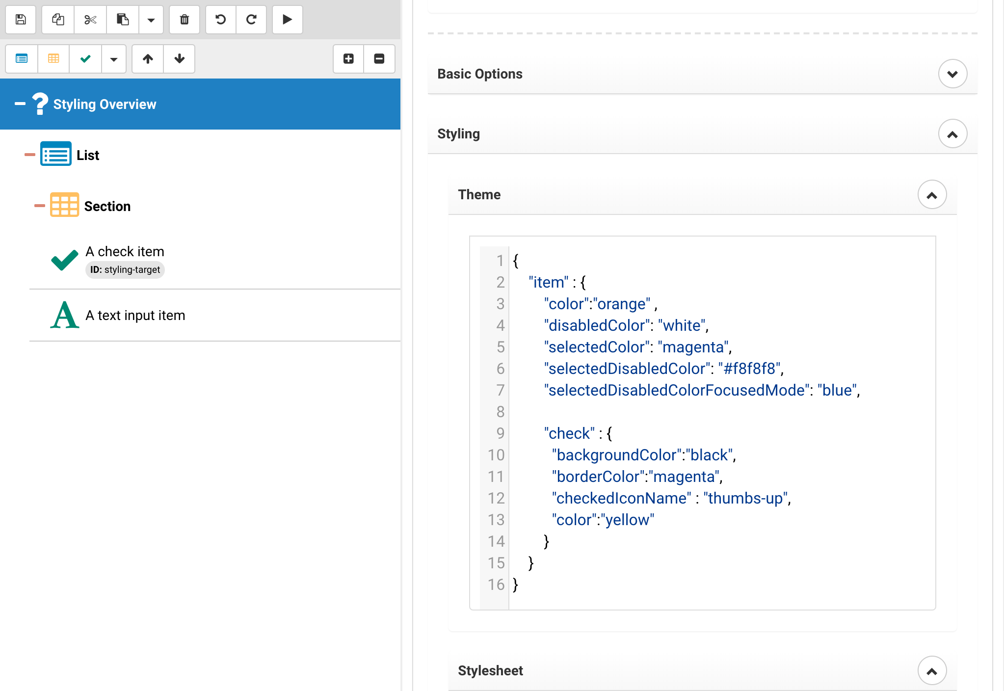
{
	"item" : {
        "color":"orange" ,
        "disabledColor": "white",
		"selectedColor": "magenta",
		"selectedDisabledColor": "#f8f8f8",
		"selectedDisabledColorFocusedMode": "blue",

        "check" : {
          "backgroundColor":"black",
          "borderColor":"magenta",
          "checkedIconName" : "thumbs-up",
          "color":"yellow"
        }
    }
}
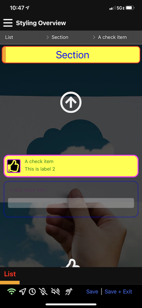
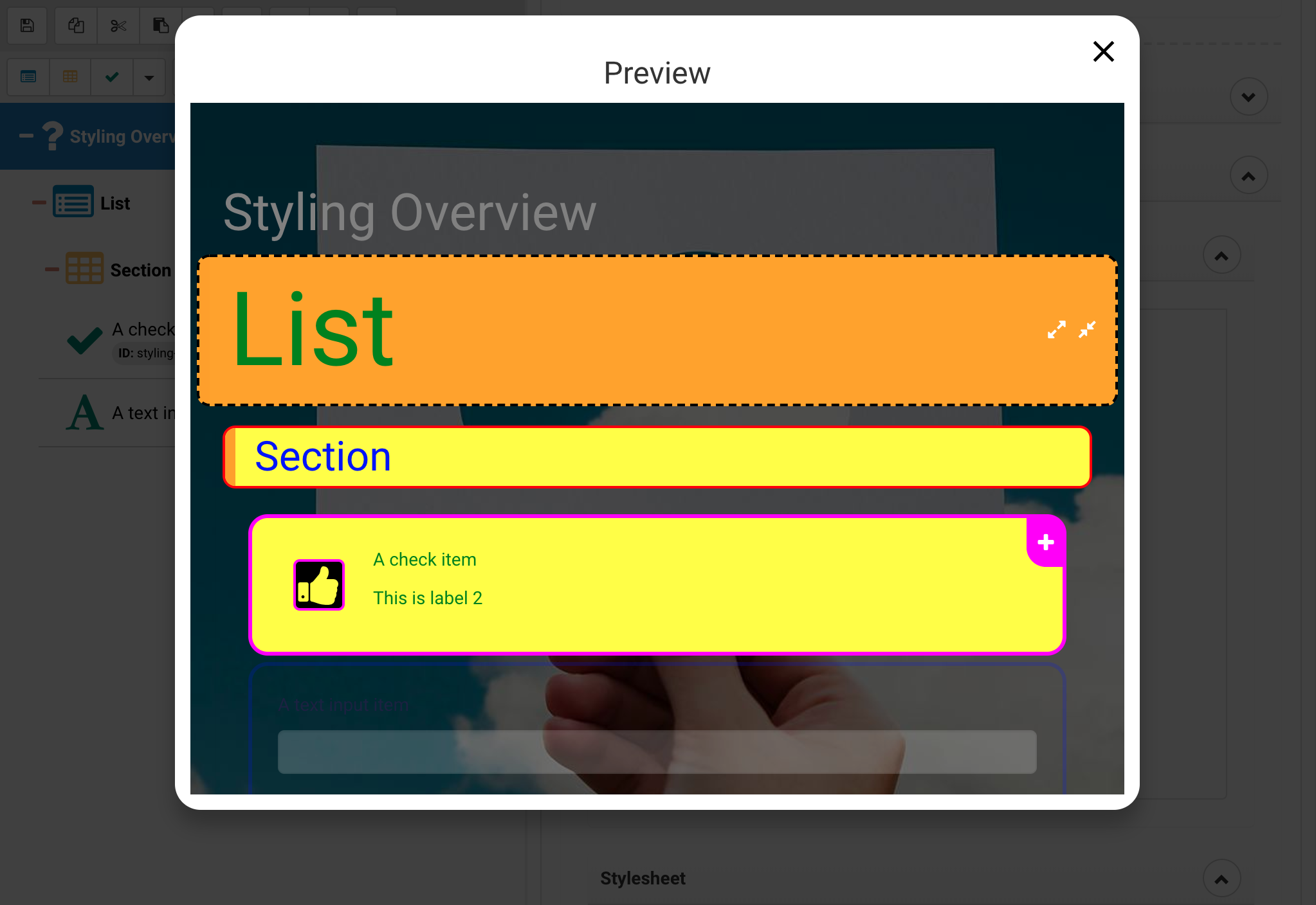
In the above we show the options available, the ability to change the color of the check, the background and border as well as the icon being used to render the check. The icon can be freely selected from the FontAwesome 5 Pro icon set.
Note There are some subtle differences between the iPhone and Web version because they were done deliberately, note that the list text is red instead of green, also it has been reduced in size.
As mentioned earlier, there is no styling of the activity title yet on mobile.