Single or Multiple Choice
The choice item allows the user to select a choice when given several options. This can be in the form of a single or multiple choice format. These options can be presented in standard format or arranged over an image or a background.
Below is an image of the choice options editor.

- Label - the string that will be displayed to the user when using the choice item
- Value - the value that can be used for logic or conditional displays
- Properties - this optional field is for css styling, such as location over an image. Click here for more information about this feature
Choice Demo
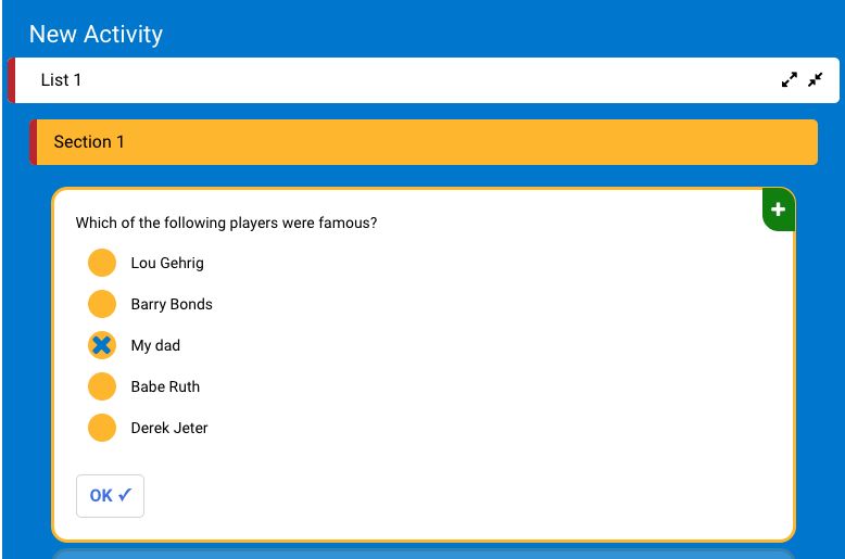
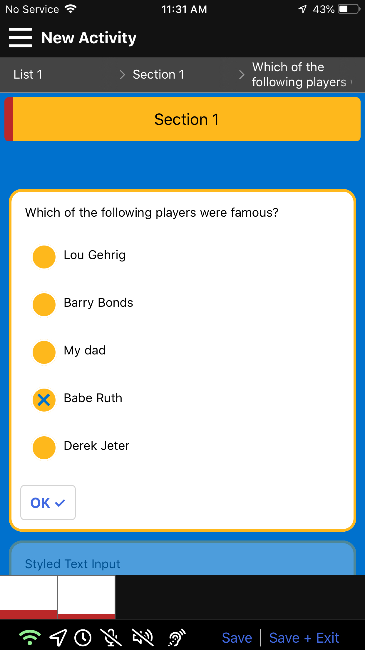
Single Choice vs Multi Choice
Single choice offers the options to the user using Radio Buttons, allowing the user to select only one of the options present. Multi-choice presents the options with checkboxes to allow the user to select multiple options. Both are shown below.
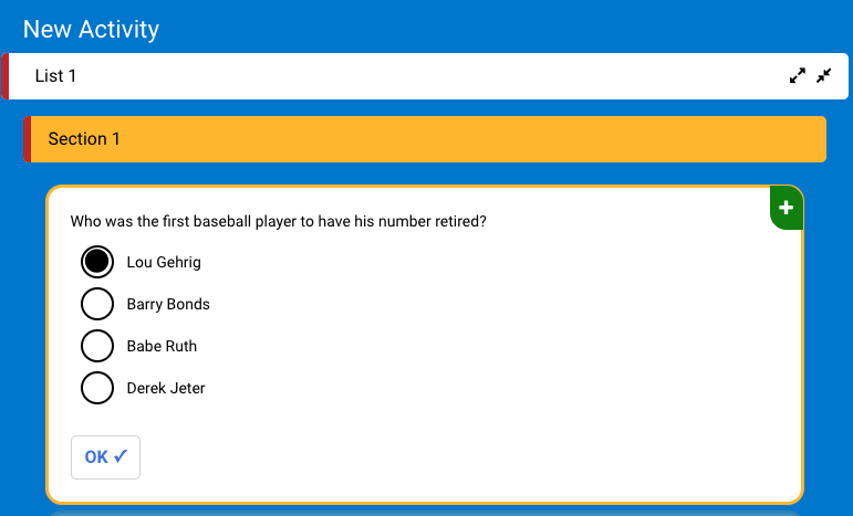
Single Choice
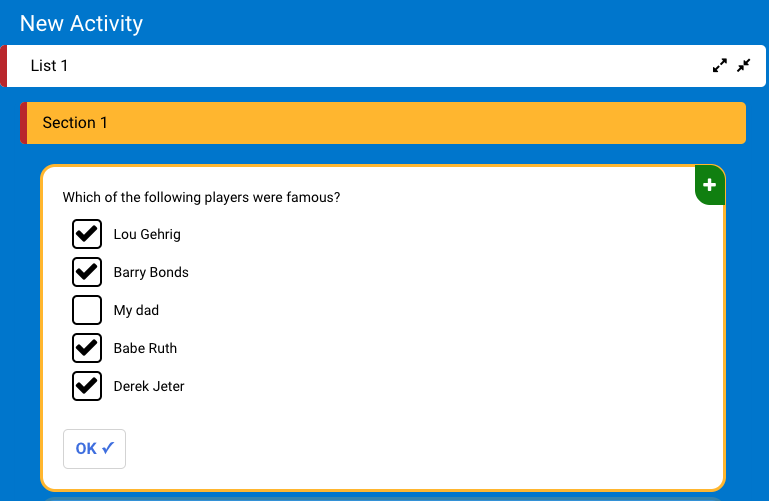
Multi Choice
Styling Choice Items
Both the single and multiple choice items are styled according to the same keyword: choice. However, because each uses different buttons (radio or check) to select options, there are subtle differences in styling. Below is the base template for styling choice items at the Activity Theme level.
{
    "item": {
        "choice": {
            "checkbox": {
                "backgroundColor": "white",
                "borderColor": "black",
                "checkedIconName": "check",
                "borderRadius": 5
            },
            "radio": {
                "backgroundColor": "#ffb81c",
                "borderColor": "white",
                "color":"#0072ce",
                "checkedIconName": "times"
            },
            "text": {
                "color": "black"
            }
        }
    }
}
In the example below, we show the changes that can be made using the above keywords to style choice items. We changed the background color of the radio button, bordercolor, and check icon name (from Fontawesome 5).