Styling Guide
This guide will cover all topics related to styling in AmbiFi as well as the specificity model to demonstrate how styling cascades.
Quick References
Introduction
There are various layers of styling that AmbiFi provides for authors, the approach mimics CSS, this page will demonstrate the styling abilities that are unified for both mobile and web deliveries.
So what are the styling layers?
- Theme- the outer most layer that allows changing of the color theme and colors of various on screen components such as text inputs, buttons and so on. These elements can not be styled at the moment in the lower layers (this is an imporvement that is in progress).
- Stylesheet- Much like a CSS stylesheet, allows addressing elements and define classes that can be applied and reused accross the activity.
- Classes- Available on Lists, Sections and Items, allow an author to define a class in the Stylesheet and assign them via the class property, multiple classes can be assigned with spaces between the class names (same as CSS/HTML).
- Styles- Available on Lists, Sections and Items, allow to specify inline styles that are specific to one element. This is the same concept as CSS styles, best used for one-offs when there is no need to reuse styles.
Cascading Behavior
Before diving into all the capabilities and styling options and examples lets first examine how AmbiFi resolves styles. Given that AmbiFi delivers to different target environments and not just web it has to emulate CSS in order to get a consistent experience accross all platforms.
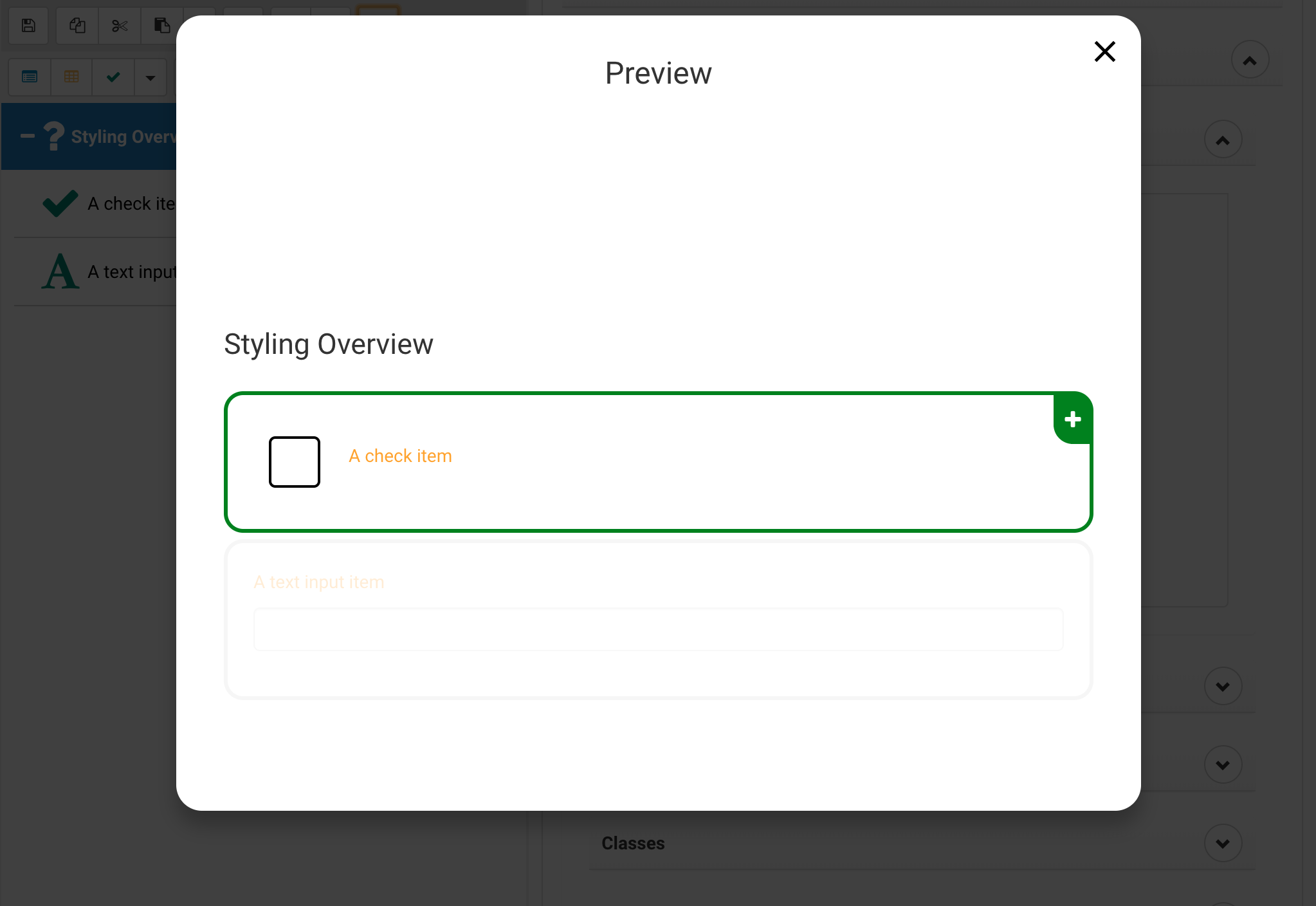
Layer 1: Theme
The theme is the outer most layer, meaning it has the least specificity. Anything else will be deemed more specific and therefore be preferred, for example a class specified in the Stylesheet and applied to an item will be more specific than the theme.
As an example we will customize the items text color to orange (This is done via the editor, by selecting the Activity and navigating to Styling > Theme .
{
	"item": {
		"color": "orange"
	}
}
Layer 2: Stylesheet element references
This would be a stylesheet entry for "list", "section" or "item". These are not very specific and a class, inline style or id based reference would take presedence over an element reference.
Select the Activity and navigate to Styling > Stylesheet
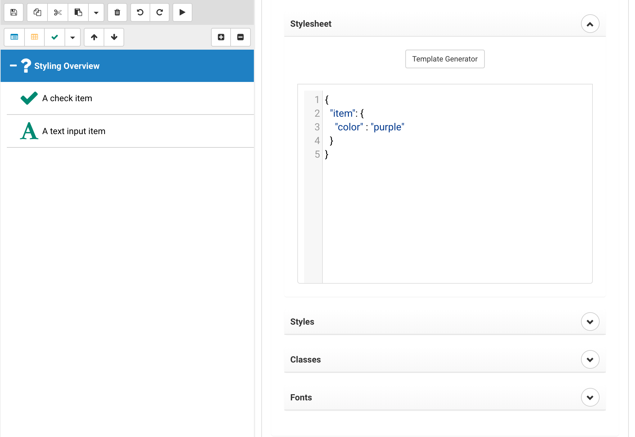
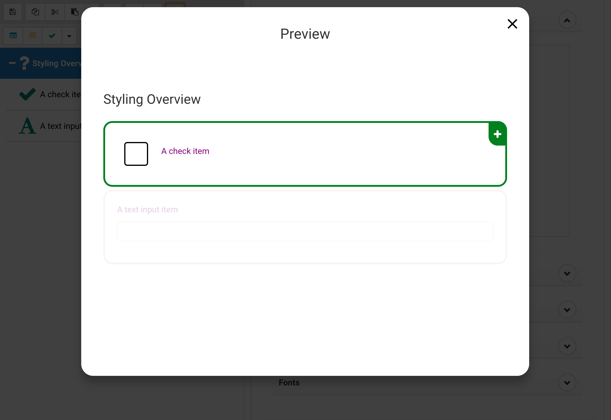
Changing the item color to purple will take presedence over the orange set in the theme.
{
	"item": {
		"color": "purple"
	}
}
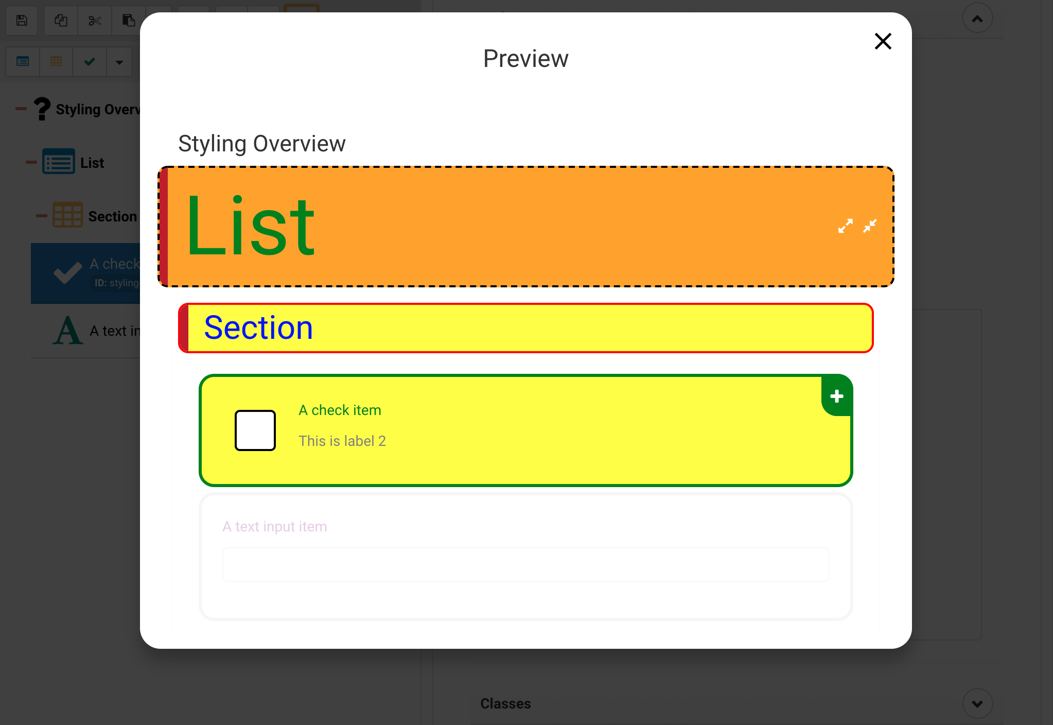
Layer 3: Stylesheet Classes
As part of a stylesheet one can define classes, this is done by placing a period before the name of an entry, this then becomes the class name. This is more specific than the previous element based style.
Select the Activity and navigate to Styling > Stylesheet (See previous layer)
{
	".itemClass": {
		"color": "red"
	}
}
After that make sure to assign classes to the appropriate item, note that classes are type independent, you can create one class and assign to multiple targets, even mixed lists, items and sections.
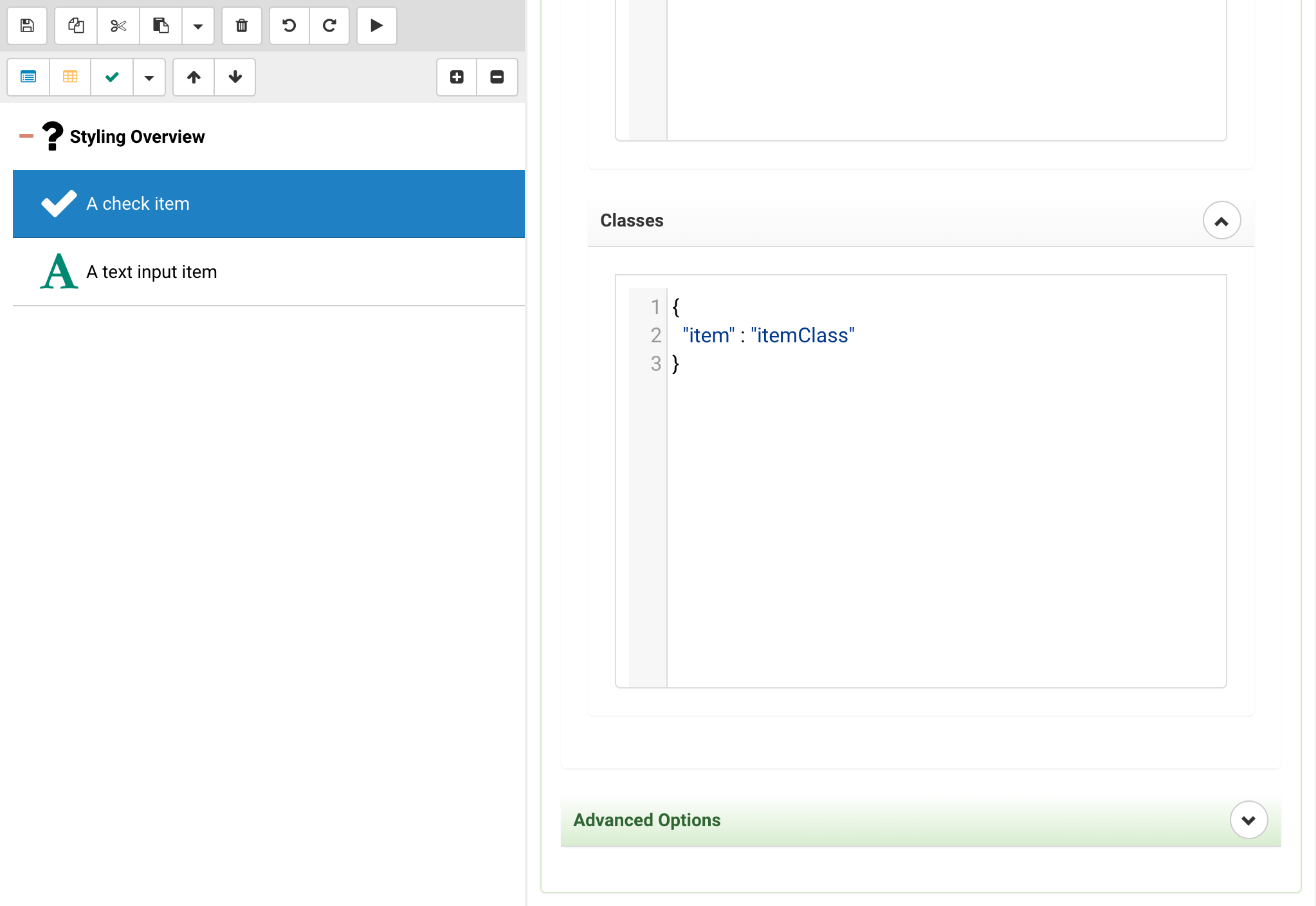
	{
		"item": "itemClass"
	}
Note: You can add multiple classes with spaces, the styling works the same as in normal CSS, the last class will take presedence over the preceeding ones.
Notice how the item with the class is no red but the item we didn't assign the class to is still purple.
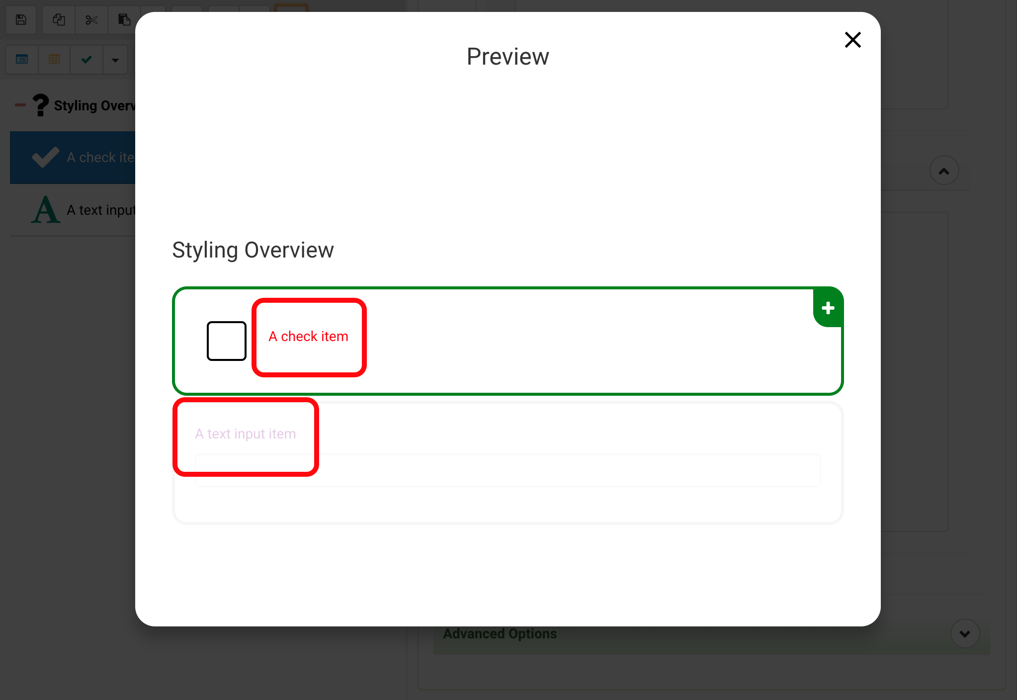
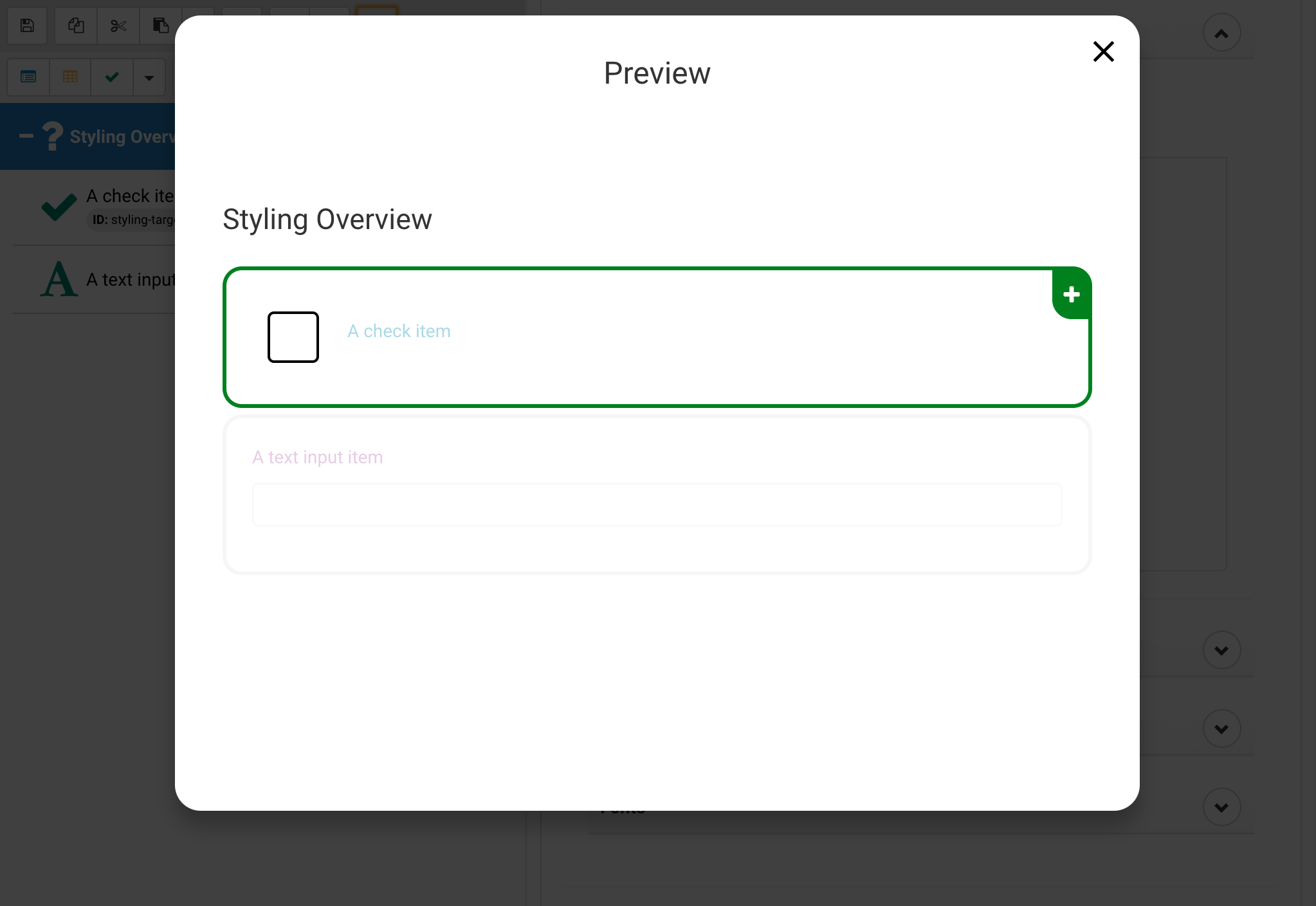
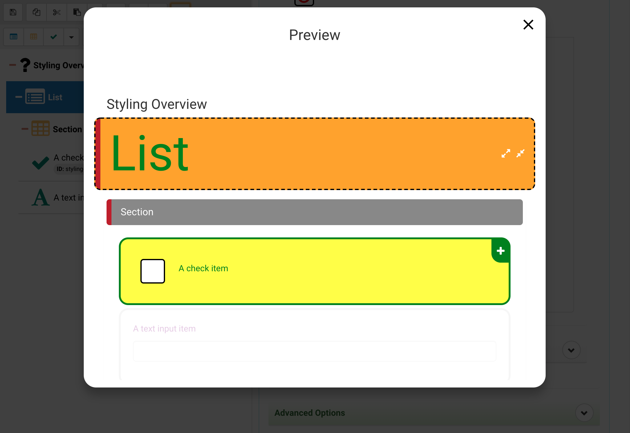
Layer 4: Stylesheet ID Selectors
Much like in CSS one can address items with IDs utilizing the hastag (#) character preceeding the id. This is more specific than classes and therefore takes presedence.
Select the Activity and navigate to Styling > Stylesheet (See previous layers)
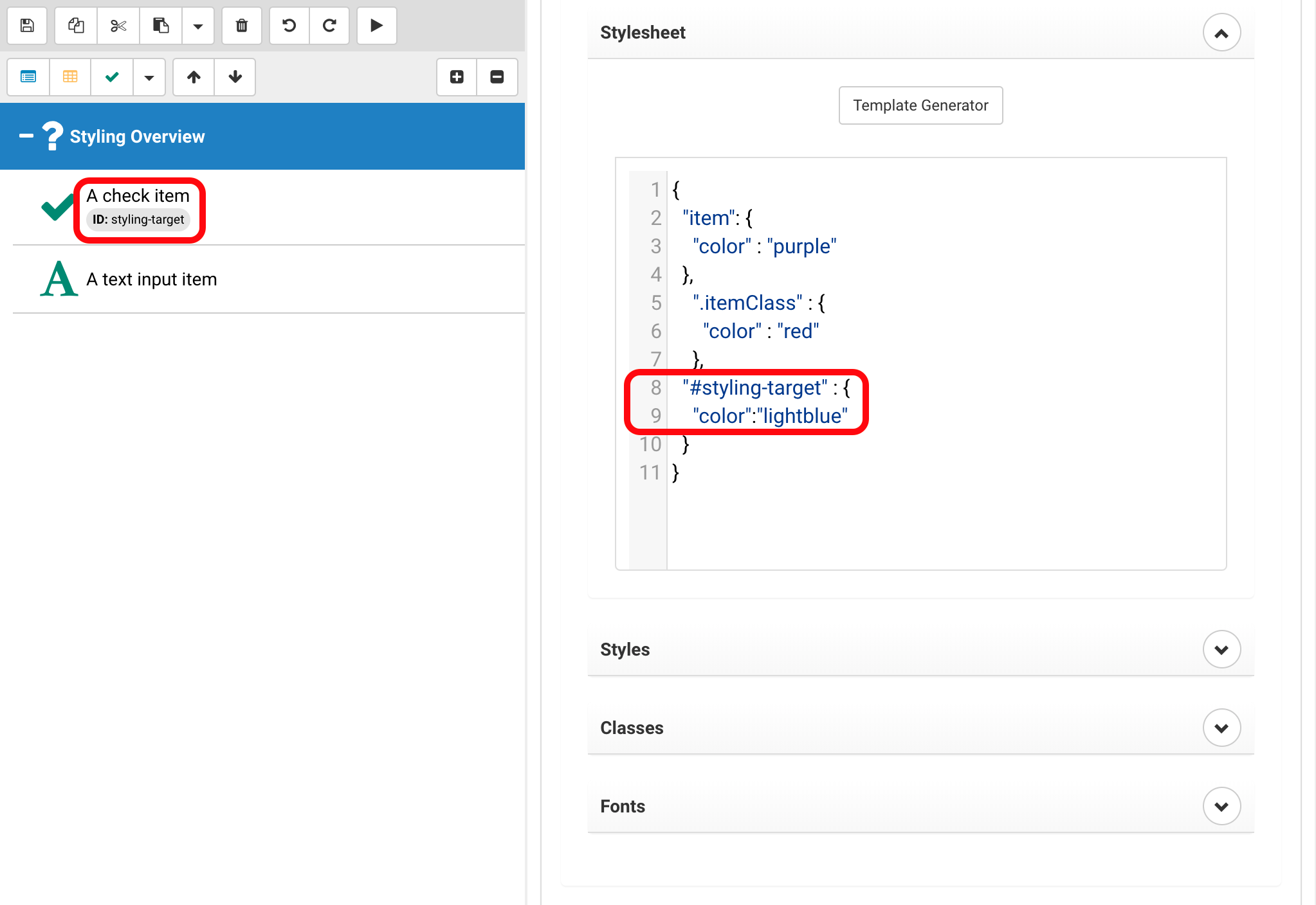
{
	"#styling-target": {
		"color": "lightblue"
	}
}
Once that is completed make sure that the item has the correct ID (in this case styling-target).
Layer 5: Inline style helpers
For some colors AmbiFi provides helpers with color pickers, this is for some quick styling, as this is very close to the component it takes presedence over all previous layers.
To see an example of these color pickers select an item, navigate to Styling > Styles and have a look at the color selectors.
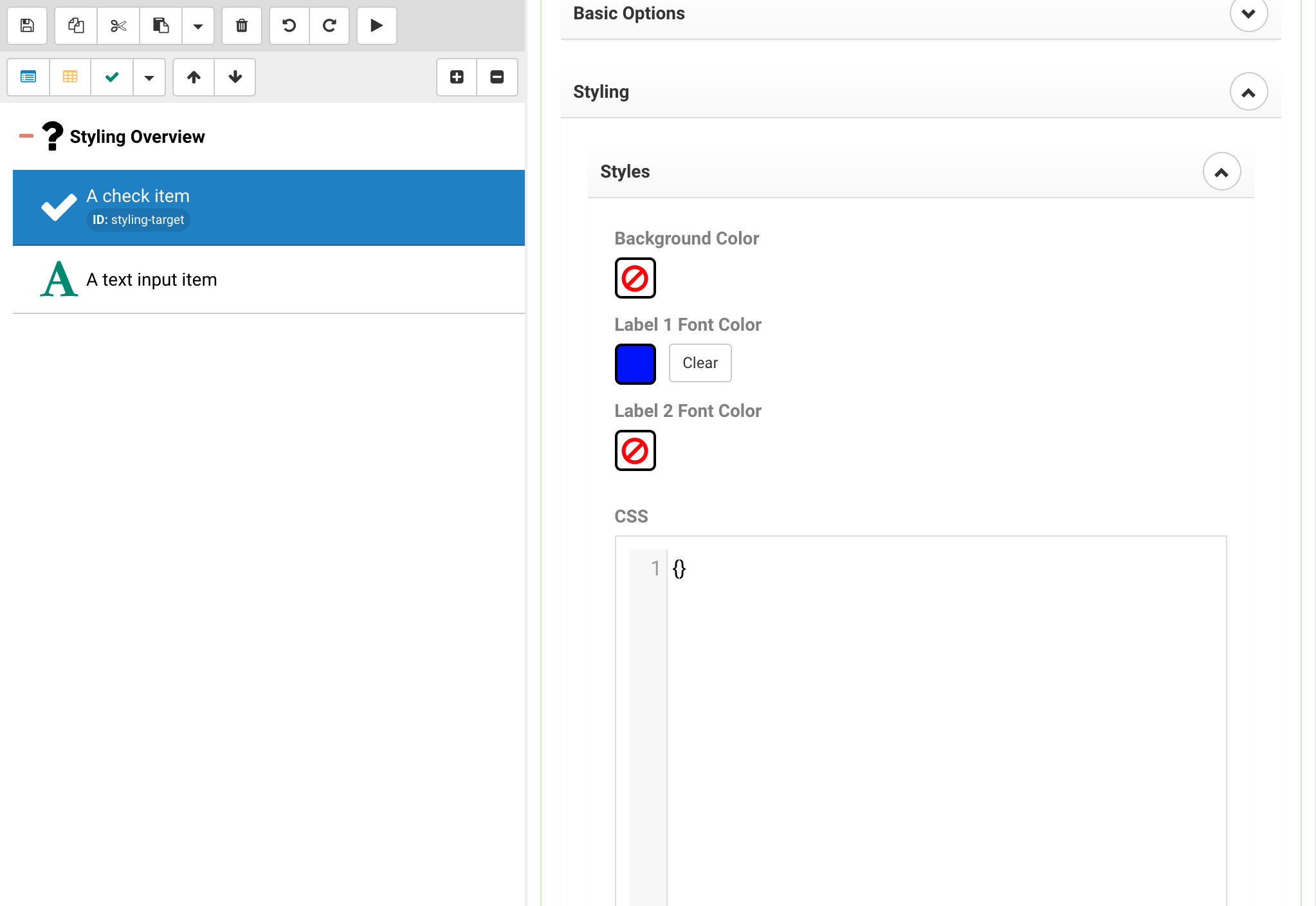
In the example above we selected dark blue, which will now be the label1 color for the selected item.
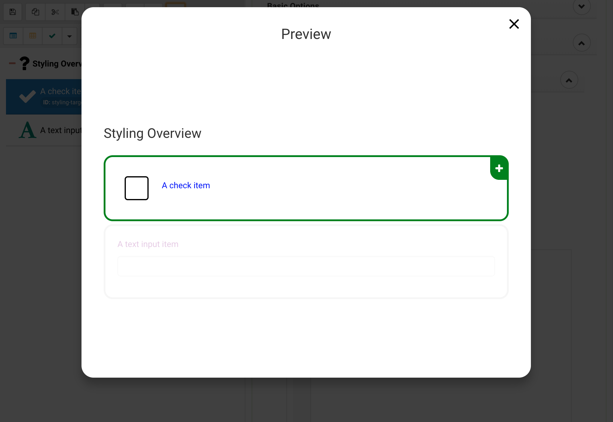
Layer 6: Inline styles
At the lowest level we assign inline styles, this is equivalent to the style attribute in HTML.
To apply an inline style navigate to an item and choose Styling > Style.
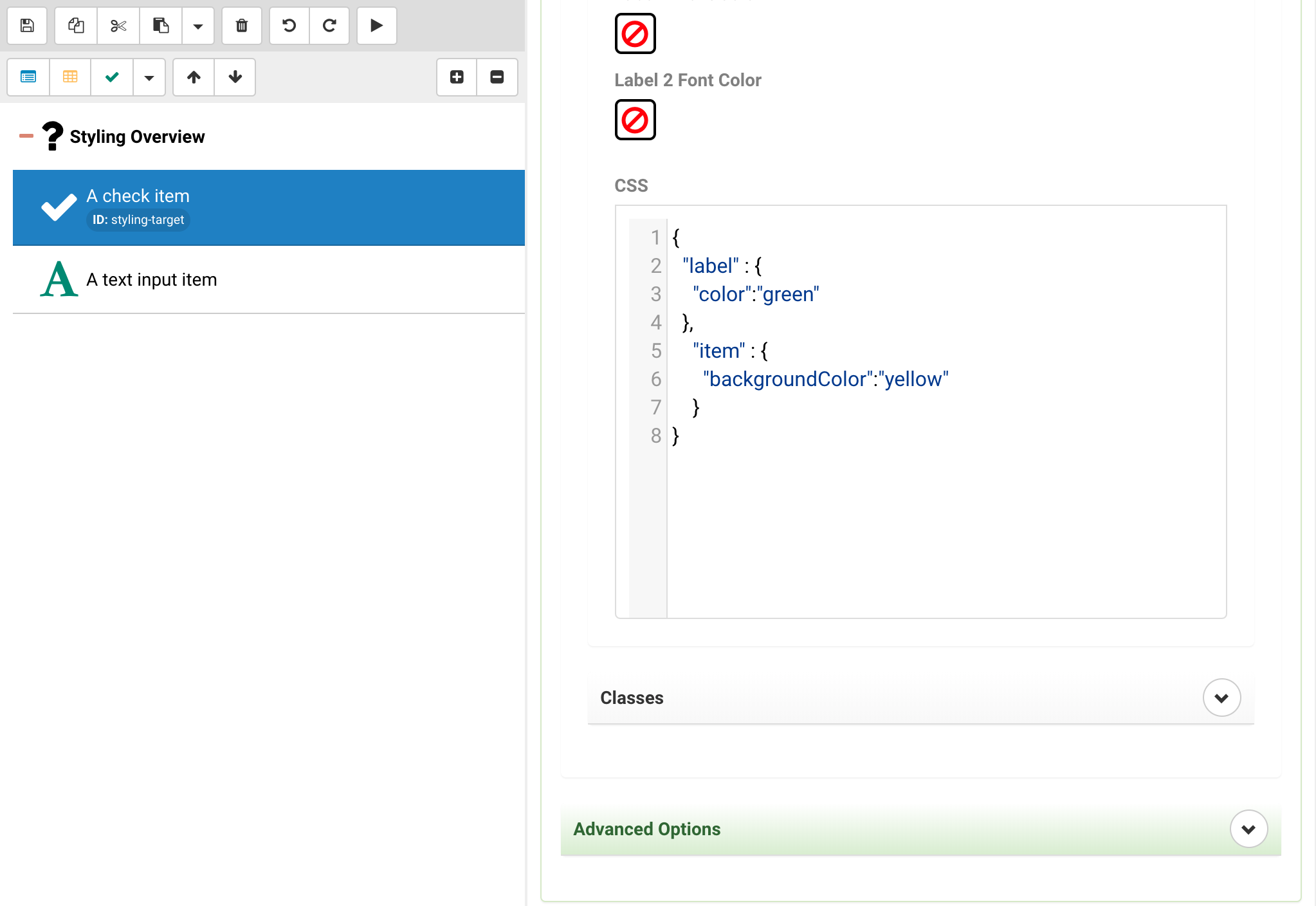
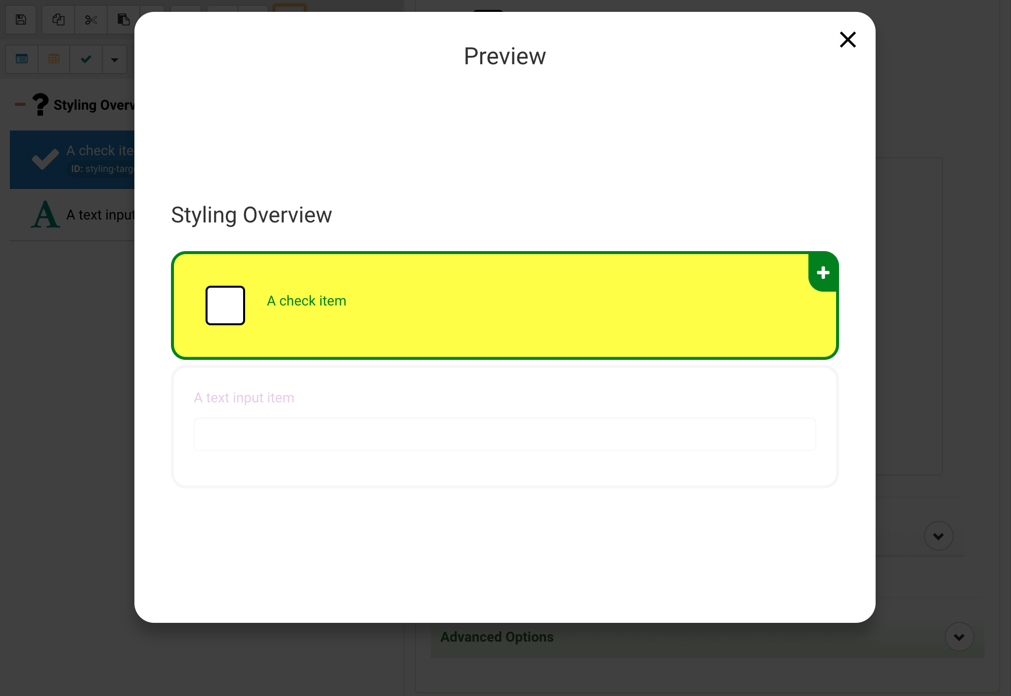
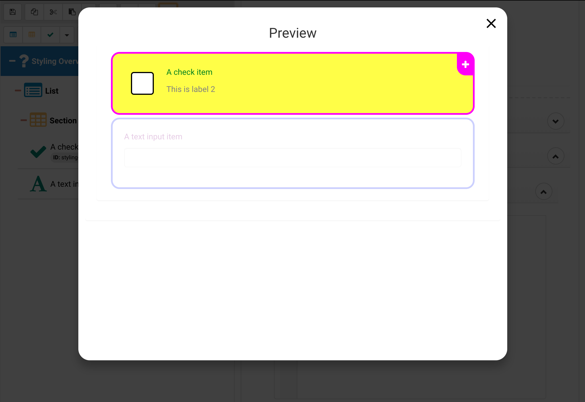
{
	"label" : {
		"color":"green"
	},
	"item" : {
		"backgroundColor":"yellow"
	}
}
This illustrates using inline styles to address the item (wrapper) and labels within the item, more about that later. As you can see the item background turned yellow and the font turned green.
Addressable Style Targets
In order to style Activities, there are different selectors that can be used to target different parts. With cascading behavior, you can style an Activity to affect eveyrthing, or get more specific at the various List, Section, and Item levels. Click below to expand upon each.
Activities
In the activity you can address the activity and the title
- The activity property will be addressing the content container element that contains lists, sections and items, this also provides the background to all of them.
- The title property will be addressing the activity title style. (currently WEB ONLY)
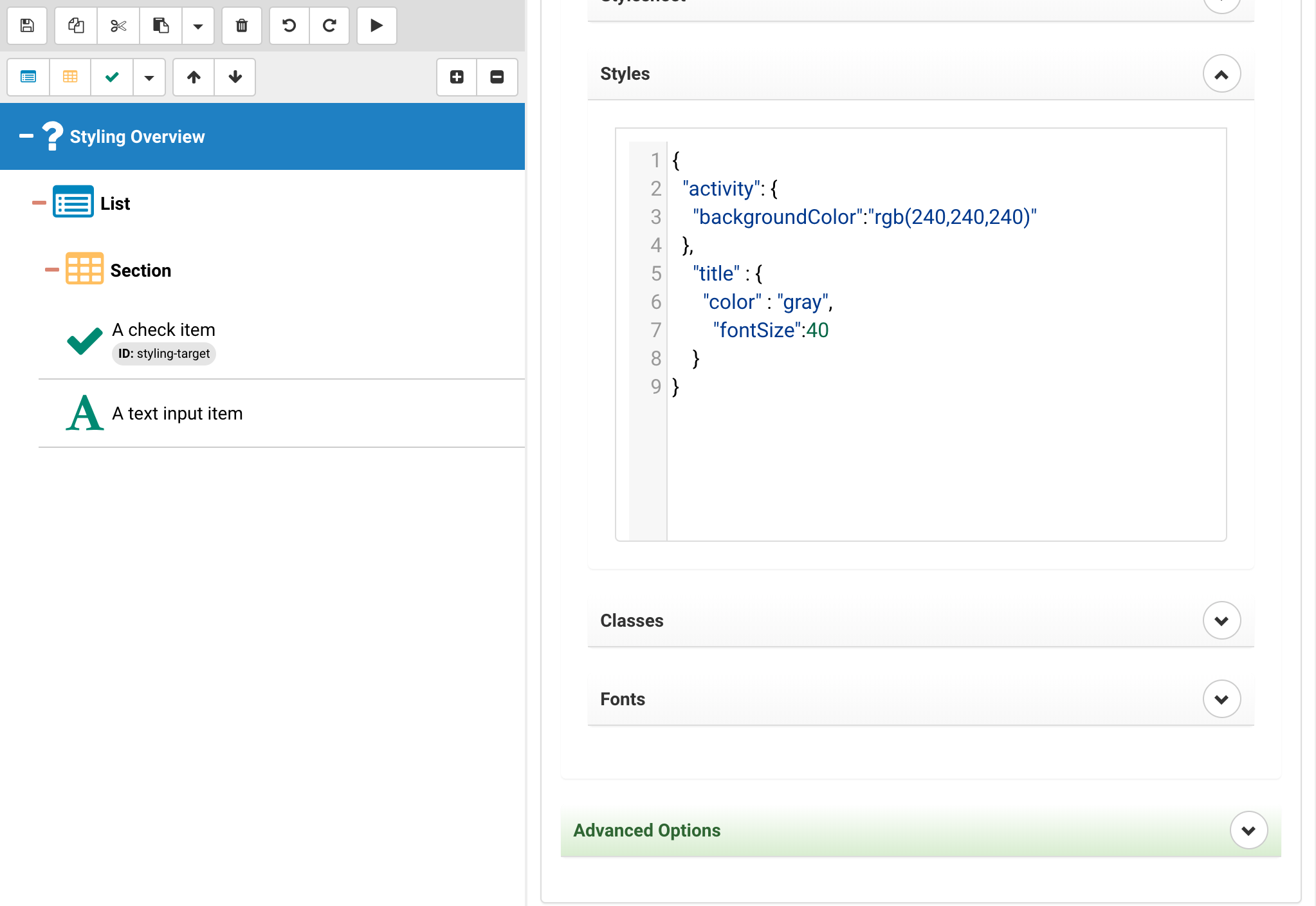
{
	"activity": {
		"backgroundColor":"rgb(240,240,240)"
	},
	"title" : {
		"color" : "gray",
		"fontSize":40
	}
}
As you can see the background and the title text have been modified, again, for the moment the mobile app doesn't support styling because the title is located in the apps top bar.
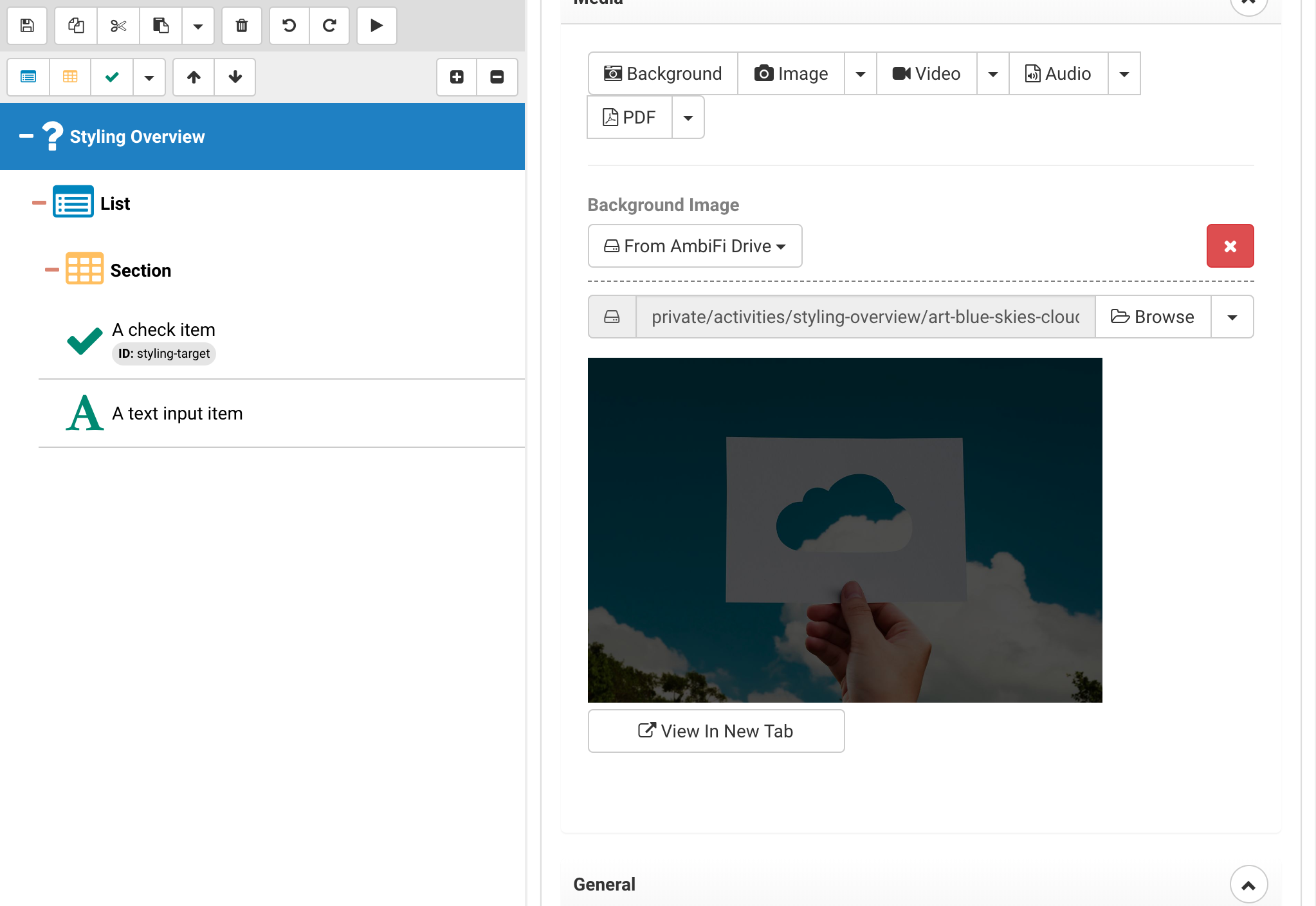
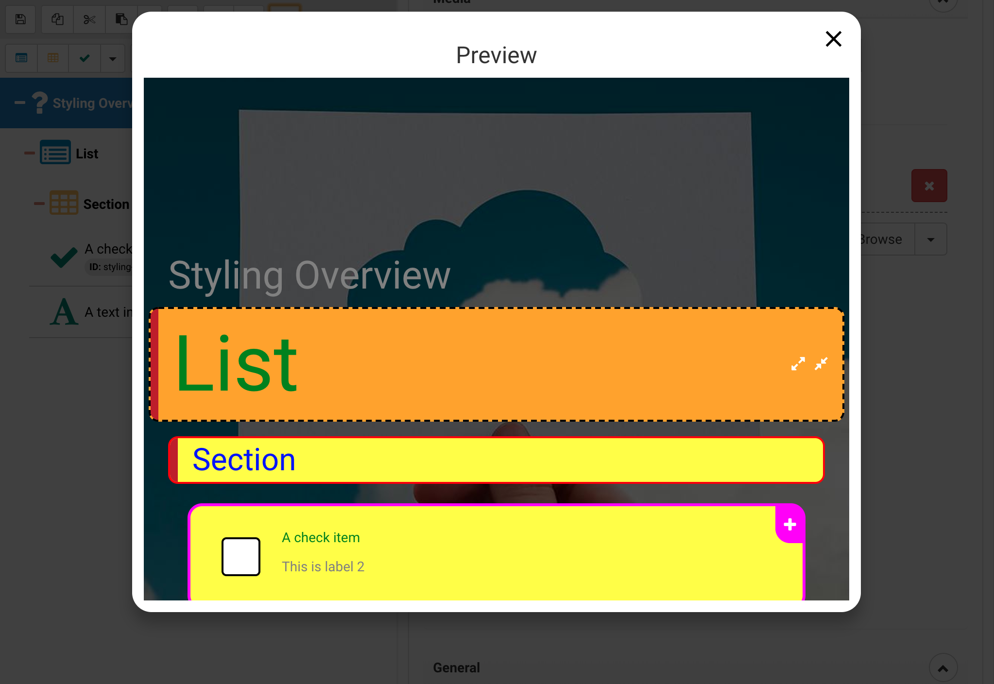
Background images can be placed on an activity as well, this will replace the default background. Use the Media upload and select "Background", by default when uploading a background image we overlay a darkening layer to make sure the content pops on top of it. If that is not desirable make sure to navigate to the Drive and upload an image directly and then use "Browse" to select it.
Once the background has been uploaded the activity will look as follows
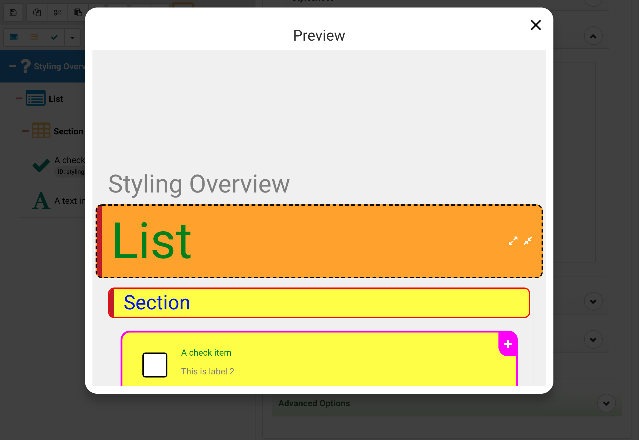
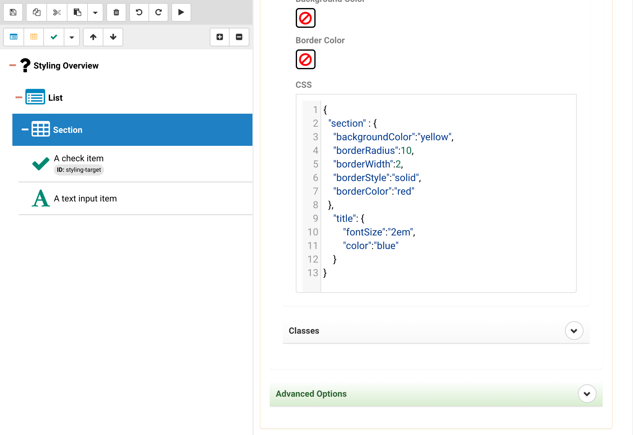
Lists
In the list you can address the list and the title
- The list property will be addressing the wrapper element
- The title property will be addressing the text within
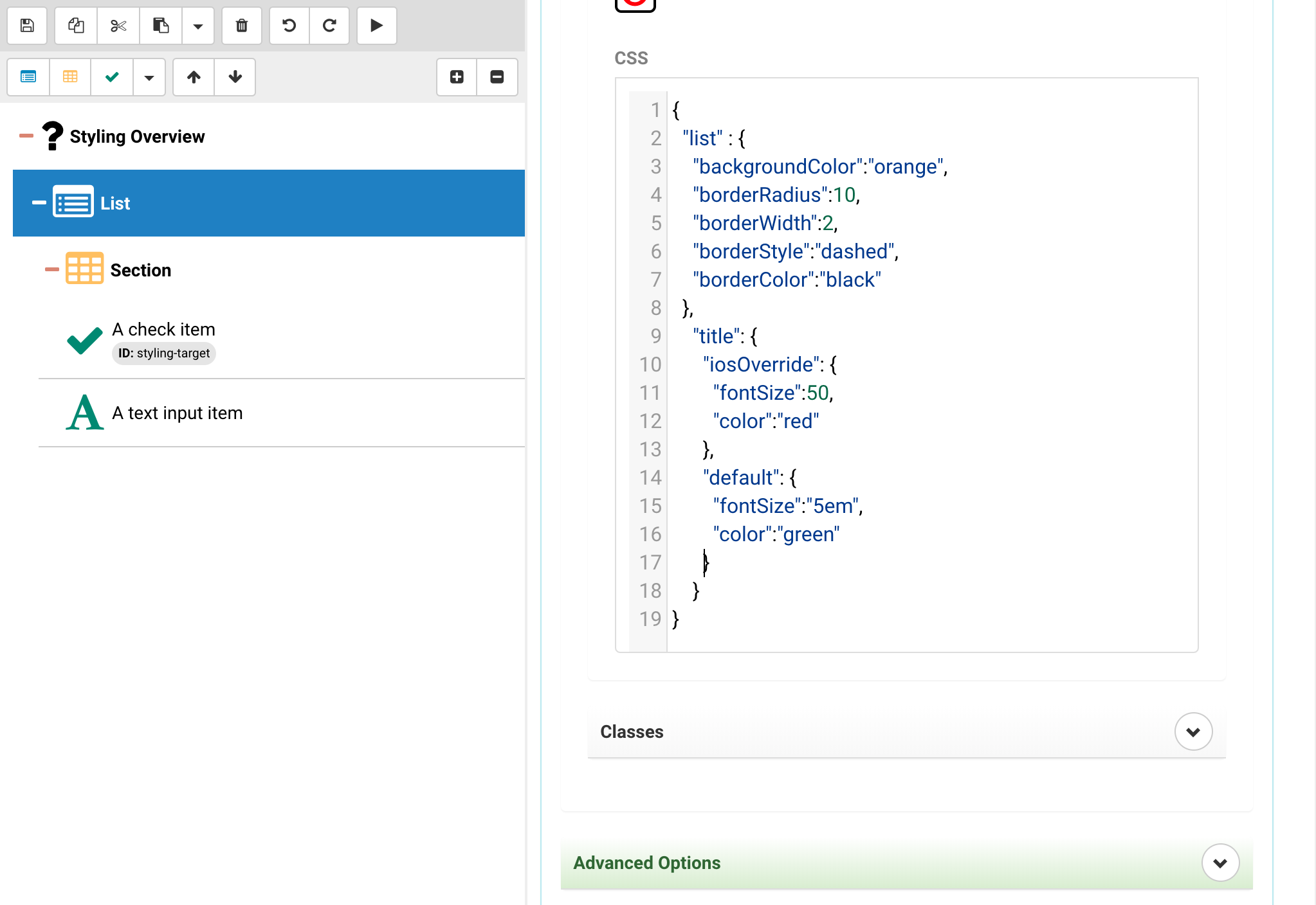
{
	"list" : {
		"backgroundColor":"orange",
		"borderRadius":10,
		"borderWidth":2,
		"borderStyle":"dashed",
		"borderColor":"black"
	},
	"title": {
		"iosOverride": {
			"fontSize":50
		},
		"default": {
			"fontSize":"5em",
			"color":"green"
		}
	}
}
In the above you can see that the title and list wrapper are addressed seperately. This also works for classes!
Note that this also includes an additional layer that we will be talking about later - the platform specific styling and overrides. Sometimes web and mobile just can not be consolidated so we provide an additional override approach to optimize the layout and styling.
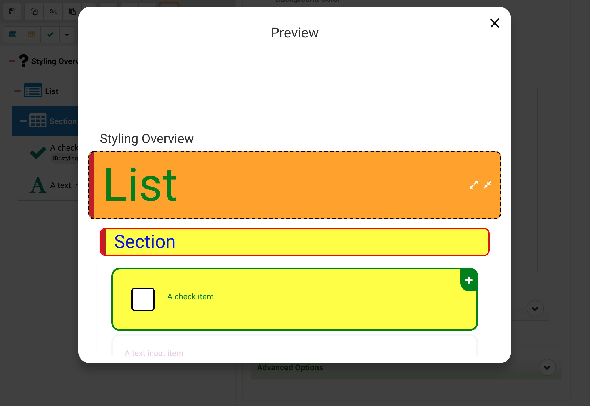
Sections
In the section you can address the section and the title
- The section property will be addressing the wrapper element
- The title property will be addressing the text within
{
	"list" : {
		"backgroundColor":"orange",
		"borderRadius":10,
		"borderWidth":2,
		"borderStyle":"dashed",
		"borderColor":"black"
	},
	"title": {
		"iosOverride": {
			"fontSize":50
		},
		"default": {
			"fontSize":"5em",
			"color":"green"
		}
	}
}
Items
In the item you can address the item, more generic label as well as more sepcific label1 and label2.
- The item property will be addressing the wrapper element
- The label property will apply to both Label 1 and Label 2, but is less specific than the following properties.
- The label1 property will apply to Label 1 and will override values in label.
- The label2 property will apply to Label 2 and will override values in label.
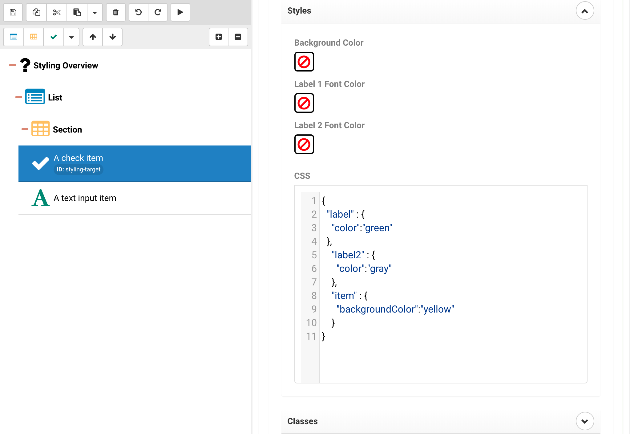
{
	"label" : {
		"color":"green"
	},
	"label2" : {
		"color":"gray"
	},
	"item" : {
		"backgroundColor":"yellow"
	}
}
Note that the Label 2 is gray while Label 1 is green. Label 1 is getting the style from the more generic label property, while Label 2 gets its own property.
Theme
The theme contains styling options for various parts of the activity, the idea being that one can customize the theme to provide some quick and basic branding for an activity. The goal of themes is reuse, meaning once a theme has been established it can be stamped onto multiple activities.
Base Theme
The following is the full base theme JSON, we are going to address individual parts of this below.
{
	"attachments": {
		"icon": {
			"color":"black"
		},
		"selectedIcon": {
			"color":"white"
		}
	},
	"placeholderStartProcedure": {
		"iconName": "arrow-circle-up",
		"color": "#eeeeee",
		"fontSize":64
	},
	"placeholderEndProcedure": {
		"iconName": "thumbs-up",
		"color": "#eeeeee",
		"fontSize": 64
	},
	"section": {
		"backgroundColor": "#888888",
		"color": "white",
		"borderRadius": 5,
		"overflow": "hidden"
	},
	"list": {
		"backgroundColor": "#444444",
		"color": "white",
		"borderRadius": 5,
		"overflow": "hidden"
	},
	"item": {
		"color": "black",
		"disabledColor": "lightgray",
		"selectedColor": "green",
		"selectedDisabledColor": "#f8f8f8",
		"selectedDisabledColorFocusedMode": "lightgray",
		"base": {
			"borderRadius": 15,
			"color": "black"
		},
		"labelOnly": {
			"backgroundColor":"#FFF8C6"
		},
		"checked": {
			"color": "green"
		},
		"comments": {
			"color": "#F9A200"
		},
		"notes": {
			"color": "#0000F9"
		},
		"sketchPadImage": {
			"color": "darkgreen"
		},
		"media": {
			"color": "purple"
		},
		"yesNo": {
			"yesButton": {
				"selectedBorderColor": "darkgreen",
				"selectedColor": "darkgreen",
				"color": "lightgreen"
			},
			"noButton": {
				"selectedBorderColor": "darkred",
				"selectedColor": "darkred",
				"color":"pink"
			},
			"naButton": {
				"selectedBorderColor": "darkblue",
				"selectedColor": "darkblue",
				"color":"lightblue"
			}
		},
		"textInput": {
			"marginTop": 5,
			"padding": 5,
			"borderRadius": 5,
			"borderStyle": "solid",
			"borderColor": "#dddddd",
			"backgroundColor": "white",
			"color": "black",
			"width":"100%"
		},
		"textInputMultiline": {
			"height": 100,
			"padding": 5,
			"borderRadius": 5,
			"borderStyle": "solid",
			"borderColor":"#dddddd",
			"backgroundColor": "white",
			"color": "black",
			"width": "100%"
		},
		"linkColor": "blue",
		"barcodeScanner": {
			"panel": {
				"backgroundColor": "transparent",
				"padding":5
			},
			"textInput": {
				"padding": 5,
				"borderRadius": 5,
				"borderStyle": "solid",
				"borderColor": "#dddddd",
				"backgroundColor": "white",
				"color": "black"
			},
			"buttons": {
				"scan": {
					"display": "flex", "backgroundColor": "skyblue", "paddingLeft": 5, "paddingRight": 5, "marginLeft": 5, "height": 30, "width": 30, "borderRadius": 5, "justifyContent": "center", "alignItems": "center", "flexDirection": "row"
				},
				"scanText": {
					"color": "black", "fontSize": 14
				},
				"clear": {
					"display": "flex", "backgroundColor": "red", "paddingLeft": 5, "paddingRight": 5, "marginLeft": 5, "height": 30, "width": 30, "borderRadius": 5, "justifyContent": "center", "alignItems": "center", "flexDirection": "row"
				},
				"clearText": {
					"color": "white", "fontSize": 14, "fontWeight":"bold"
				}
			}
		},
		"sketchPad": {
			"backgroundColor": "white",
			"color": "gray",
			"borderStyle": "dashed",
			"borderColor": "gray",
			"borderWidth": 3
		},
		"picker": {
			"basic": {
				"backgroundColor": "white",
				"width":"100%"
			},
			"buttons": {
				"backgroundColor": "transparent",
				"color": "blue",
				"selectedBorderColor":"blue"
			}
		},
		"choice": {
			"checkbox": {
				"backgroundColor": "white",
				"borderColor": "black",
				"checkedIconName": "check",
				"borderRadius": 5
			},
			"radio": {
				"backgroundColor": "white",
				"borderColor": "black",
				"checkedIconName": "circle"
			},
			"text": {
				"color": "black"
			}
		},
		"check": {
			"backgroundColor": "white",
			"borderColor": "black",
			"checkedIconName": "check",
			"borderRadius":5,
			"color":"black"
		},
		"datePicker": {
			"backgroundColor": "white",
			"color":"black"
		},
		"mediaPicker": {
			"button": {
				"color": "blue",
				"fontWeight":"bold"
			},
			"imagePlaceholder": {
				"width": 100, "height": 100, "borderStyle": "dashed", "borderWidth": 1, "borderColor": "gray"
			}
		},
		"addressSearch": {
			"panel": {
				"backgroundColor": "white",
				"width":"100%"
			},
			"selectAddressLink": {
				"color": "blue",
				"fontWeight":"bold"
			},
			"navigateLink": {
				"color":"blue"
			},
			"text": {
				"color": "black",
				"fontWeight":"bold"
			}
		},
		"buttonOk": {
			"underlayColor": "lightgray",
			"height": 40,
			"marginTop": 10,
			"borderStyle": "solid",
			"borderWidth": 1,
			"borderColor": "lightgray",
			"borderRadius": 5,
			"backgroundColor": "white",
			"fontWeight": "bold",
			"color": "royalblue"
		},
		"ranking": {
			"dialogs": {
				"editFullscreen": {
					"wrapper": { "backgroundColor": "white" },
					"header": {
						"height": 70, "borderBottomWidth": 1, "borderBottomColor": "lightgray", "padding": 10
					},
					"footer": {
						"borderTopWidth": 1, "borderTopColor": "lightgray", "padding": 10, "paddingLeft": 0
					}
				},
				"insertItem": {
					"wrapper": { "backgroundColor": "white" },
					"header": {
						"height": 70, "borderBottomWidth": 1, "borderBottomColor": "lightgray", "padding": 10
					},
					"footer": {
						"borderTopWidth": 1, "borderTopColor": "lightgray", "padding": 10, "paddingLeft": 0
					}
				}
			},
			"buttons": {
				"edit": { "display": "flex", "width": 100, "backgroundColor": "skyblue", "height": 40, "borderRadius": 5, "justifyContent": "center", "alignItems": "center", "flexDirection": "row", "borderWidth":1, "borderColor":"lightgray","borderStyle":"solid" },
				"editText": { "color": "white", "fontSize":16, "fontWeight":"bold" },
				"editFullscreen": { "display": "flex", "width": 100, "backgroundColor": "skyblue", "height": 40, "borderRadius": 5, "justifyContent": "center", "alignItems": "center", "flexDirection": "row", "borderWidth": 1, "borderColor": "lightgray", "borderStyle": "solid" },
				"editFullscreenText": { "color": "white", "fontSize": 16, "fontWeight": "bold" },
				"editFullscreenDone": { "display": "flex", "backgroundColor": "skyblue", "height": 40, "borderRadius": 5, "width": 100, "flexDirection": "row", "justifyContent": "center", "alignItems": "center", "borderWidth": 1, "borderColor": "lightgray", "borderStyle": "solid" },
				"editFullscreenDoneText": { "color": "white", "fontWeight": "bold", "fontSize": 16 },
				"insertDone": { "display": "flex", "backgroundColor": "skyblue", "height": 40, "borderRadius": 5, "width": 100, "flexDirection": "row", "justifyContent": "center", "alignItems": "center", "borderWidth": 1, "borderColor": "lightgray", "borderStyle": "solid" },
				"insertDoneText": { "color": "white", "fontWeight": "bold", "fontSize": 16 },
				"insertCancel": { "display": "flex", "backgroundColor": "red", "height": 40, "borderRadius": 5, "width": 100, "flexDirection": "row", "justifyContent": "center", "alignItems": "center", "borderWidth": 1, "borderColor": "lightgray", "borderStyle": "solid" },
				"insertCancelText": { "color": "white", "fontWeight": "bold", "fontSize": 16 },
				"doneEditing": { "display": "flex", "width": 100, "backgroundColor": "skyblue", "height": 40, "borderRadius": 5, "justifyContent": "center", "alignItems": "center", "flexDirection": "row", "borderWidth": 1, "borderColor": "lightgray", "borderStyle": "solid" },
				"doneEditingText": { "color": "white", "fontSize": 16, "fontWeight": "bold"}
			},
			"placeholder": {
				"panel": {
					"display": "flex",
					"width": "100%",
					"borderWidth": 1,
					"borderStyle": "dashed",
					"borderRadius": 10,
					"height": 50,
					"backgroundColor": "white",
					"alignItems":"center",
					"justifyContent": "center",
					"marginBottom": 10,
					"padding": 10
				},
				"text": {
					"fontWeight": "bold",
					"color": "black",
					"fontSize": 18
				}
			},
			"item": {
				"panel": {
					"display": "flex",
					"minHeight": 50,
					"borderRadius": 10,
					"backgroundColor": "rgb(211, 211, 211)",

					"justifyContent": "center",
					"marginBottom": 10,
					"padding":10
				},
				"text": {
					"color": "black",
					"fontSize": 14
				},
				"panelDragging": {
					"display": "flex",
					"minHeight": 50,
					"borderRadius": 10,
					"backgroundColor": "rgba(211, 211, 211, .8)",

					"justifyContent": "center",
					"marginBottom": 10,
					"elevation": 4,
					"shadowOffset": { "width": 2, "height": 2 },
					"shadowColor": "grey",
					"shadowOpacity": 0.3,
					"shadowRadius": 5,
					"padding": 10
				},
				"panelDraggingText": {
					"color": "black",
					"fontSize": 14
				},
				"panelSelectableForInsert": {
					"display":"flex",
					"minHeight": 50,
					"borderRadius": 10,
					"backgroundColor": "rgb(211, 211, 211)",

					"justifyContent": "center",
					"marginBottom": 10,
					"padding": 10
				},
				"panelSelectableForInsertText": {
					"color": "black",
					"fontSize": 14
				},
				"panelSelectableForInsertSelected": {
					"display": "flex",
					"minHeight": 50,
					"borderRadius": 10,

					"justifyContent": "center",
					"marginBottom": 10,
					"backgroundColor": "skyblue",
					"color": "white",
					"padding": 10
				},
				"panelSelectableForInsertSelectedText": {
					"color": "white",
					"fontSize": 14
				}
			}
		},
		"weather": {
			"textNoWeatherData": {
				"color": "black"
			},
			"title": {
					"fontWeight": "bold",
					"color": "black"
			},
			"summary": {
				"color": "black"
			},
			"dataPoint": {
				"label": {
					"color": "black"
				},
				"value": {
					"fontWeight": "bold",
					"color": "black"
				}
			}
		}
	},
	"itemSimple": {
		"labelOnly": {
			"backgroundColor":"#FFF8C6"
		},
		"selectedColor": "green",
		"selectedDisabledColor": "#ffffff"
	},
	"home": {
		"footer": {
			"color": "#666666"
		}
	},
	"modal": {
		"content": {
			"bgColor": "#ffffff"
		}
	},
	"comments": {
		"sketchPad": {
			"container": {
				"bgColor": "lightgray"
			},
			"canvas": {
				"bgColor": "white",
				"penColor": "blue"
			}
		}
	},
	"nav": {
		"bgColor": "#ffffff",
		"profile": {
			"bgColor": "#B2DBFF",
			"color": "black",
			"borderBottomColor": "#4C9DE5",
			"buttonTxtColor": "white"
		},
		"item": {
			"color": "black",
			"disabledColor": "gray",
			"selectedColor": "blue"
		},
		"section": {
			"color": "#121212",
			"iconColor": "#121212"
		},
		"picker": {
			"title": {
				"color": "#4681b9"
			},
			"item": {
				"color": "black",
				"iconColor": "#121212"
			}
		},
		"learnMore": {
			"color": "blue"
		},
		"hr": {
			"color": "#eeeeee",
			"bgColor": "#cccccc"
		}
	},
	"checkbar": {
		"check": {
			"color": "darkgreen",
			"bgColor": "#eeffee"
		},
		"skip": {
			"color": "darkblue",
			"bgColor": "#eeeeff"
		},
		"locateItem": {
			"color": "#000000",
			"bgColor": "#eeeeee"
		},
		"listen": {
			"color": "green",
			"disabledColor": "#168e8c",
			"bgColor": "#e5f9f9"
		},
		"emergency": {
			"color": "#cc0000",
			"bgColor": "#ffcccc"
		},
		"switchShowMode": {
			"bgColor": "rgb(40,40,40)",
			"color": "lightgray"
		}
	}
}
Each element of the basic theme JSON is expanded upon below. Click on the section to expand its contents and read about what each specific attribute refers to.
Attachments
These are additional comments and notes (textual, media and sketches) that have been attached to the item. In order to change the color of the icons you can use the folloqwing top level data structure
{
	"attachments": {
		"icon": {
				"color":"black"
		},
			"selectedIcon": {
				"color":"white"
		}
	}
}
The basic items attachment icons look as follows
To illustrate its purpose we will be changing the color of the attachment icon of our base example.
{
	"attachments": {
		"icon": {
				"color":"red"
		},
			"selectedIcon": {
				"color":"yellow
		}
	}
}
Placeholder Icons
Below shows the placeholder keywords singled out and being modified for our purposes.
{
	"placeholderStartProcedure": {
	  "iconName": "plane-departure",
	  "color": "green",
	  "fontSize": 64
	},
	"placeholderEndProcedure": {
	  "iconName": "plane-arrival",
	  "color": "#b277ed",
	  "fontSize": 48
	}
}
Placeholder Start Procedure and Placeholder End Procedure refer to the icon that appears before and after starting a section. The icon can be freely selected from the FontAwesome 5 Pro icon set. To the right is an example of what the icon being selected and styled looks like.
Note The placeholders only appear on mobile and not web versions of the activity.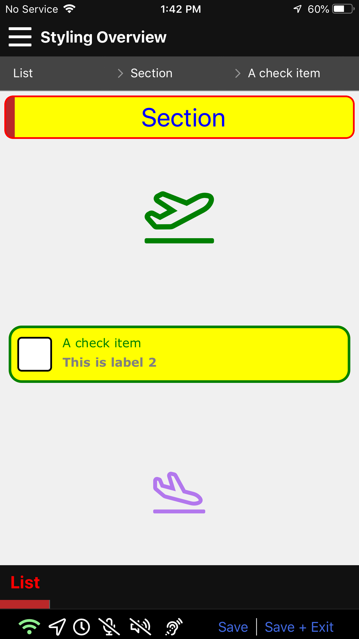
Various Item Types
Information for each specific item type can be found here.
Item Border
Items for the main content and data collection layer of an activity. They can be checkboxes, textboxes, date and time fields and much more. For more on item types please see Item types
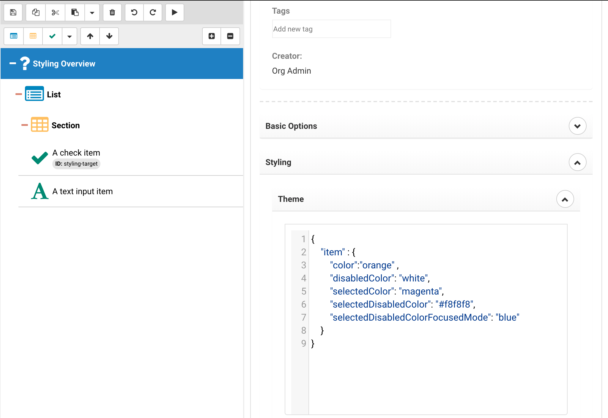
{
	"item": {
		"disabledColor": "lightgray",
		"selectedColor": "green",
		"selectedDisabledColor": "#f8f8f8",
		"selectedDisabledColorFocusedMode": "lightgray"
	}
}
The above will determine the border color for selected items, selected items that are disabled (for example because they are past a mandatory item that hasn't been selected yet), disabled color for border color when the item is not selected but disabled and the disabled border color when focus mode is active (focus mode makes items semi transparent so a different border color is sometimes needed).
Legacy Documentation
In order to view the previous version of the documentation please click here.