Styling Guide
Basic information on styling Ambifi activities
This guide outlines the basic procedure for styling activities within Ambifi.
Basic Hierarchy Attributes
Below is a diagram showing the basic attributes of an Activity. Read on for more information.
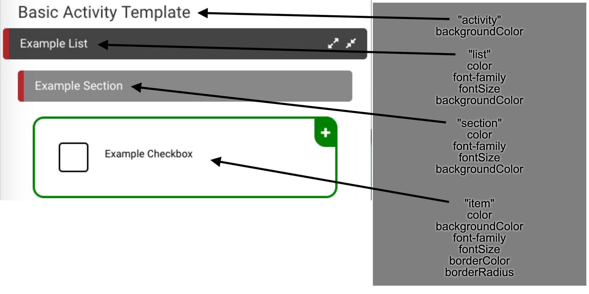 Figure 1. Basic Attributes
Each layer of the hierarchy has its own individual attributes that can be set. Most have the same types of attributes so it isn't too difficult to get the hang of styling. The universal attributes are detailed below.
- color- accepts an rgba(0,0,0,0) or hex (#FFFFFF) value for the text color within the specific element. You can find a great resource for picking out colors here at the Adobe site
- backgroundColor- accepts an rgba(0,0,0,0) or hex (#FFFFFF) value for the background color of the specific element
- fontSize- accepts a font size for the text within the element
- font-family- accepts font name for the text to change the specific font
- borderColor- accepts an rgba(0,0,0,0) or hex (#FFFFFF) value for the color of the border surrounding the element
- borderRadius- determines the roundness of the edges of the border surrounding the specific element (the value 0 represents perfectly rectangular edges and 90 represents completely circular edges)
Implementing Style
Styling in Ambifi is based on specificity rules (just like CSS). This means that the more specific layers of style will take
precedence over more general ones. For more information on these rules, check out
The W3 Schools Documentation for it.
To style the entire Activity, select the Activity in the outline view and navigate to the section shown below named "Stylesheet."
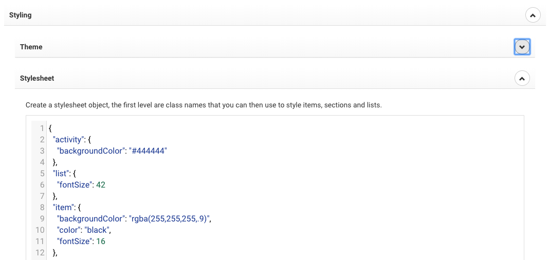 Figure 2. Stylesheet
Styling Syntax
The stylesheets within the editor require a very specific syntax. The editor interperets this input as css but requires keywords to be in quotes and the id's to be sectioned off by brackets. Below is a copyable template that can be used to style very quickly. Simply replace the keywords with your desired style. Paste this into the stylesheet section shown above and make sure to delete any attribute names you do not wish to change.
Template in Action
Ambifi Theme Information
Theming in Ambifi is a bit different from styling. Theming targets properties of an Activity that aren't immediately present to the user. For example, the item property checked refers to an item's appearance after it has been checked. Below is a theming template to be placed in the Theme section of an Activity. To the right is a diagram with some basic theming vs. styling elements.
- placeholderStartProcedure - icon that appears when Activity first starts on mobile. Icon name is directly from fontawesome.io
- placeholderEndProcedure - icon that appears following the final item in an Activity, also from fontawesome
- item: checked - color of text after item has been checked, usually safe to set to inherit so the color remains the same throughout a procedure
- check - see diagram to right, properties of the checkbox itself
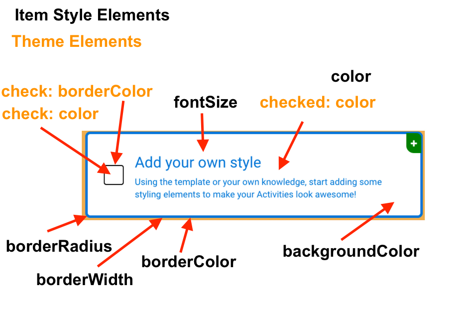 Style/Theme diagram