Picker
The Picker item consists of either a dropdown menu or buttons that a user can pick from.
- View Type
- Picker - Default, displays choices in a dropdown menu
- Buttons - shows options in the form of buttons
- Dropdown Filter - shows options in the form of a dropdown filter (can also multi-select)
- Advance on select - automatically advances to the next item on selection rather than having user manually press OK
- Add Picker Items - selects whether or not to add picker items in the editor manually or using a JSON datasource
-
Picker editor
- Label - the string that will be displayed
- Value - the value that can be used for logic or conditional displays
- Properties - optional styling field
- Placeholder - optional suggested value selected before the user opens the picker
- Default - optional pre-selected value when the user opens the picker
Picker Demo
The picker can be presented in a dropdown format or a button list. Below shows the difference in appearance between the two

Web Player Dropdown
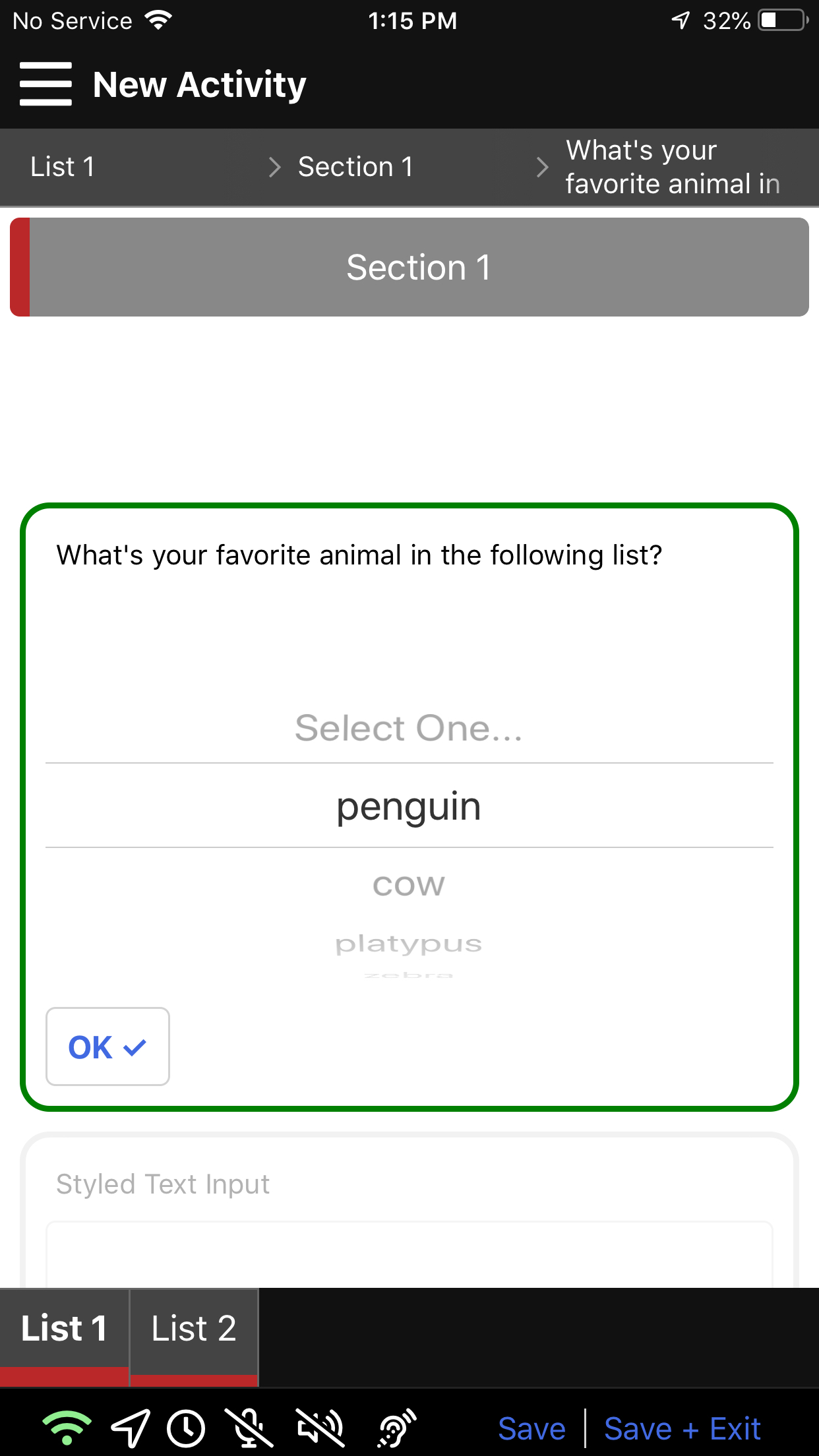
Mobile Dropdown
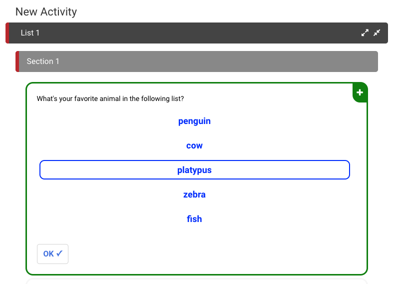
Web Player Button Style

Mobile Button Style