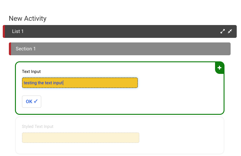
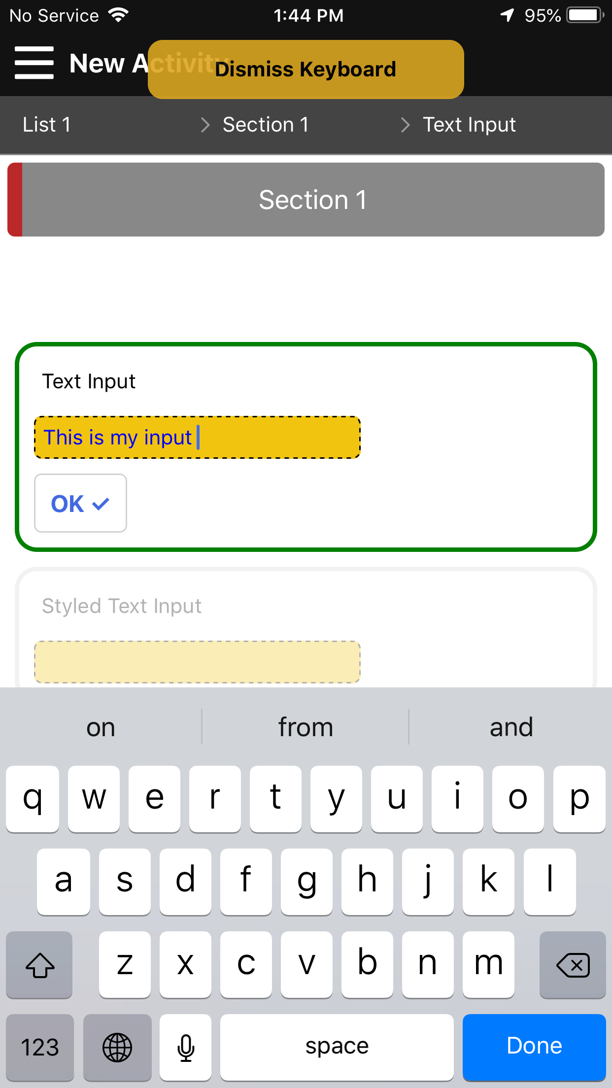
Text Input (single or multiline)
The text input field can be used to get input from the user in the form of text. There are two types of text inputs, single and multiline. In addition, there are many different options that can be applied to each text item in order to suit a specific use case.
- Placeholder - allows for placeholder text to appear before the user has clicked inside the textbox
- Default Value - allows for input text to be in the box before the user has entered or changed anything inside of it
- Max Length - sets a maximum length for the user input inside the text box
- Mask Type
- Currency - formats the user input with a currency symbol ($)
- Phone - formats the user input in the form of a phone number
Text Input Demo
Styling Text Input
The following code can be placed inside the Theme section of the activity to style all text inputs within the Activity. For more information on the cascading nature of styling in Ambifi, click here.
{
    "item" : {
        "textInput": {
            "marginTop": 5,
            "padding": 5,
            "borderRadius": 5,
            "borderStyle": "dashed",
            "borderColor": "black",
            "backgroundColor": "#f1c40f",
            "color": "blue",
            "width":"60%"
        },
        "textInputMultiline": {
            "height": 100,
            "padding": 5,
            "borderRadius": 5,
            "borderStyle": "solid",
            "borderColor":"#dddddd",
            "backgroundColor": "white",
            "color": "black",
            "width": "100%"
        }
    }
}
In the example above, we show the different options available to change with text input. The margins, padding, border style (dashed or solid), border color, background, color, and width are all available to be changed. In our example, we change the width to only 60%, the border style to dashed, and the colors.
For multiline text input, the only difference is the height property, which determines the height of the box for multiple lines of text to be submitted.