Yes/No Item
The Yes/No item type presents a label and the the ability to respond Yes/No to it. This can be very useful for gettign simple user input for different applications.
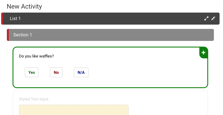
- Show N/A - adds an N/A option to the Yes/No input
- Advance on Select - option to make the Item completed or not once user has seleced yes or no
- Link On Select - the Yes/No type allows for different target links depending on user choice
- Yes Link ID - target link when Yes is selected
- No Link ID - target link when No is selected
- N/A Link ID - target link when N/A is selected
Yes/No Demo
Styling Yes/No
Yes/No buttons can be styled to reflect different options. Each buttons border color and internal color can be modified, as shown below.
The following code can be placed inside the Theme section of the activity to style all Yes/No buttons within the Activity. For more information on the cascading nature of styling in Ambifi, click here.
{
    "item": {
		"yesNo": {
			"yesButton": {
				"selectedBorderColor": "darkgreen",
				"selectedColor": "darkgreen",
				"color": "lightgreen"
			},
			"noButton": {
				"selectedBorderColor": "darkred",
				"selectedColor": "darkred",
				"color":"pink"
			},
			"naButton": {
				"selectedBorderColor": "darkblue",
				"selectedColor": "darkblue",
				"color":"lightblue"
			}
        }
    }
}
In the example below, we show the changes that can be made using the above keywords to style Yes/No/NA buttons in Ambifi. Before and after styling are shown on web and mobile.

For multiline text input, the only difference is the height property, which determines the height of the box for multiple lines of text to be submitted.